


The Shell logo is among the most readily recognized symbols across the globe. It represents Royal Dutch Shell plc, which is the fifth largest company in the world. But this oil and gas giant wasn’t always so massive. Sprung from humble beginnings with a vast and storied history, it took Shell over a century to become the company they are today.
A Brief History
Marcus Samuel Sr. was an immigrant living in London who ran a shop selling painted seashells and other antiques and trinkets. In 1833, in an effort to expand his business, Samuel began the import and export of goods from Asia--thus forming M. Samuel & Co. As the business grew, his two sons eventually took over operations. At first they traded mainly in commodity goods such as sugar and flour. However, as they expanded operations they became interested in the oil exporting business that was happening in Azerbaijan.
A major problem with the oil trade at the time was in transportation. The barrels would leak and couldn’t be shipped with other goods and they also took up more space, further limiting ship loads. This is where the Samuels revolutionized oil transportation. They commissioned the first bulk tanker to carry their loads. The maiden voyage of bulk oil transport was in 1892 upon their tanker named the Murex; the result of which reduced costs enormously. (The Murex was sunk by a German submarine in 1916)
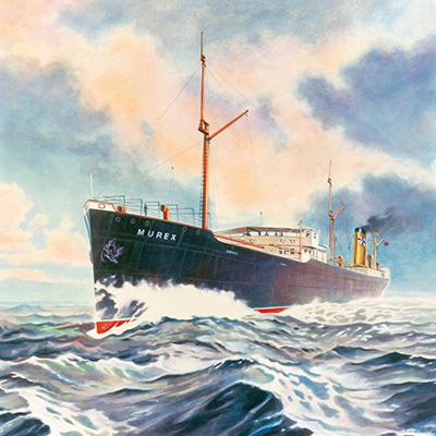 Painting of the Murex, the first bulk oil tanker [Image: Shell]
In 1907, “Shell” Transport and Trading Company merged with the Royal Dutch Petroleum Company in an effort to better compete against Standard Oil. They are today known as Royal Dutch Shell plc, headquartered in the Netherlands and incorporated in the United Kingdom.
Throughout the 20th and 21st centuries, Shell would fund expeditions and fuel the British Army while continuing to expand their empire. Post-war demand for oil was a major driving force behind Shell’s growth. With the growth came the opportunity to create research labs to further develop refinement techniques and study environmental impact.
The Logo
Shell is a company whose logo has evolved considerably throughout their history. Logos can change to keep current with design trends, but also evolve to reflect the image and values of the brand as it matures. Conversely, a company will often times go through re-branding to mitigate negative public perception or in an effort to revitalize a faltering brand.
In the case of Shell the evolution seems to be primarily based on design trends. This can be seen easily when comparing their range of logos and noting the refinements that come with each generation.
The logo design is based on a giant scallop (Pecten maximus) and is therefore known as the “pecten.” For the first four design iterations the logo is in black and white monochrome and exhibit a very illustrative hand-drawn appearance. This was a popular style in the early 20th century, partially due to aesthetic and also to printing costs and capabilities. Here are the logos of other familiar brands from around the same time to give reference.
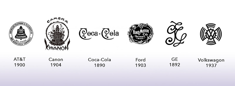 Examples of logos from other popular brands during the same period. Note the hand-drawn illustrative quality.
In the first drawing of the shell logo we see a shell shape from a top-down quarter view. It’s an oblique view of an organic shape that makes it difficult to determine the object. Without context, one might guess this is a stone or bean or any number of organic objects.
So it makes sense that in 1904 they switched to full view of the broad side of the scallop. This is the easily recognizable shell shape that provides continuity across the rest of their logo transformations. It is worth noting the shell is defined by negative space against the solid background. They will abandon this look until 1961 when they try it again in color.
The solid background must not have translated well, because in 1909 they switch to an image positive drawn in a traditional fashion. It is the same general scallop shape with some refinements to simplify the drawing.
By 1930, Shell has begun to stylize the scallop which now resembles a decorative element more closely than it does a life-drawing. The shading has been all but eliminated as the comb-like pectin is now described by solid, tapering lines.
We see the first color logo in 1948 where, additionally, the word “SHELL” is featured prominently in the center of the image. The scallop retains much of the hand-drawn look and the combs have been reduced to allow for the copy. It is thought that the red and yellow colors may have been chosen to relate to the colors of the Spanish flag. Shell built their early service stations in California, which was once a Spanish colony. Although, the colors could have been chosen for no reason other than their bold appeal.
In 1955 the logo has been stylized further yet still retains the fan-like shape of an actual scallop. It is still apparent what the image represents. The text has been changed to red to match the rest of the logo. In this version we can see a fabricated roundness reflected in the logo, which is in parallel to manufacturing technology at the time. Think of the shaped metal on classic cars and bicycle designs during this era. It’s all sweeping curves and rounded edges.
Then in 1961 Shell decides to return to a solid background--this time red. The design of the logo element remains otherwise unchanged.
The remaining three versions of the logo are essentially the same and are what we are familiar with today. Stylization of the scallop have continued into an almost abstract shape. Because of the history of the pecten we are able to distill recognition from the design, but without that context a person might mistake the ridges of the combs for the rays of a sunset.
On top, the shell ridges have been smoothed to one continuous curve with the remaining edges being sharpened into stark geometric angles. The outer edge line has been thickened substantially, perhaps as a compromise to the solid background. We see a change in the typeface between 1961-1971-1995, which probably was a reflection of typographic trends during those periods.
Finally, the Shell logo forgoes the text completely in 1999 to be just the stylized shell symbol. Any more is no longer necessary, as it is such an iconic design. It is difficult to predict with any accuracy whether the logo will change again anytime soon and to guess what it might change to. It is certain, though, that eventually it will.
We Work With Logos
Companies grow and Shell is a prime example of what kind of growth is possible given the right conditions. And growth brings change. It’s amazing how a decorative shells and antiques shop evolved into one of the largest companies in the world.
We want to help you grow. Whether you operate a small business or a manage promotions for a huge corporation we want to work with you to put your logo and branding on a large variety of custom made products. Maybe it’s your first logo, or maybe it’s your sixth design--people still need to see it.
From simple engraved aluminum keychain bottle openers and carabiners to totally custom die cast 3-dimensional metal, we can make it for you. View our range of products to find one that is right for you. And if you don’t see it, give us a call. We want your brand to look its best on our high quality custom made products so you can grow your business as easily as possible.